The Gamification App - our work on the BIONIC project

By Valentina Bartali and Monique Tabak

Four years ago, RRD (with different partners from all around Europe) started working on the European project BIONIC. In May, this project came to an end and, now, we would like to look back at our work and what we have achieved in these years.

The description of the project is written in this way: Personalized Body Sensor Networks with Built-In Intelligence for Real-Time Risk Assessment and Coaching of Ageing workers.

I can imagine that, from an outsider, with this description, it can be complicated to understand what BIONIC actually is.

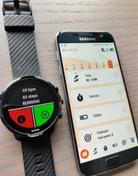
BIONIC was a project aiming to develop a technological innovation able to detect real-time risks in the workplace (think, for example, about the industrial sector or factories) and in everyday life. Additionally, this technology has monitoring and coaching functions in order to help preventing musculoskeletal disorders. The system consists of a suit with sensors in different parts of the body, a smartwatch to measure heart rate and steps, and two applications. One application was developed to give feedback on the user's movements, while the other application, Gamification app, was developed by RRD to motivate and coach users to live a healthy lifestyle, also outside the work environment. 
bionic
the_gamification_app

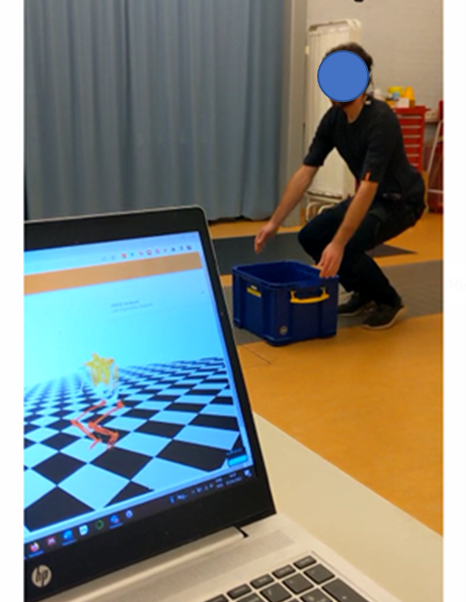
On the picture on your left, you can see how the suit is and what is shown on the computer. On the picture on your right, you can see the smartwatch and the application we created.


In BIONIC, our work was focused on estimating fatigue from sensors by machine learning algorithms (which you can read more about in the papers [1] and [2] in the reference list below) and the development of coaching strategies for healthy lifestyle for the gamification application.

In this blog article, I would like to tell you a bit more about this gamification application we developed, which has the following components (to get a better idea, see video below):

  • Overview of measured daily activity: users can get insights on their daily activities (step counts). The application (through an algorithm) can estimate the moments in which the user shows sedentary behavior (staying too much sitting) and the periods in which (s)he is doing some activity.
  • Overview of subjective fatigue: Every day, users will be asked, with a question in the app, how tired they feel that day. The answers to this question will be shown in a graph.
  • Personalized exercise program: physiotherapy exercises advised to users in form of trainings and depending on which part of the body a user has the most issues (for instance, back, neck, or legs).
  • Motivational support via virtual coach bill and gamification elements: Proposing physiotherapy exercises according to the feedback received from the BIONIC system and the needs of the users. These exercises are given by a virtual coach, Bill, who guides, motivates, and supports users. The Gamification App has gamification features to prompt users to do the exercises proposed and to change their physical activity (when needed). These gamification features entail earning points through:
    • Challenges: a set of goals that the user can set up for him-/herself
    • Achievements: a set of tasks that the user can achieve whilst using the Gamification App

The Gamification App was also evaluated in clinical settings at Roessingh to investigate if this technology could be of added value. From this evaluation, we discovered that the application could really help patients to be more aware of their activity patterns and it could motivate them to change their activity behaviors and facilitate rehabilitation.

We are really proud of what we achieved in these years considering that we were able to develop a working application of which added value was seen. The project is now finished, but we will bring with us what we have learnt during these years and we hope to further develop and use the application for other purposes. 

Reference list


[1] Marotta L, Buurke JH, van Beijnum B-JF, Reenalda J. Towards Machine Learning-Based Detection of Running-Induced Fatigue in Real-World Scenarios: Evaluation of IMU Sensor Configurations to Reduce Intrusiveness. Sensors. 2021; 21(10):3451.

[2] Marotta L, Scheltinga BL, van Middelaar R, Bramer WM, van Beijnum B-JF, Reenalda J, Buurke JH. Accelerometer-Based Identification of Fatigue in the Lower Limbs during Cyclical Physical Exercise: A Systematic Review. Sensors. 2022; 22(8):3008
RE-SAMPLE: AI-powered care for patients with COPD and other chronic diseases

Written by Eline Te Braake and Christiane Grünloh

RE-SAMPLE is a European project targeting people with COPD and other chronic conditions. The goal of RE-SAMPLE is to develop a technology that supports patients and their caregivers. This technology will help patients manage their COPD and other chronic conditions. Along with 9 other partners, RRD is collaborating on this project to shape and develop the RE-SAMPLE technology. The project started in March 2021 and will run for a total of 4 years. RE-SAMPLE has received funding from Horizon (Grant agreement No. 965315).

USER-ORIENTED. When designing an eHealth intervention, it is important to consider the needs and desires of those who will use it. Ultimately, we want RE-SAMPLE to have an added value in practice for both people with COPD and their healthcare professionals. Of course, we also want that after the project, RE-SAMPLE is actually successfully implemented in the health care system. To do this, we need to learn from the attitudes, experiences, and needs of people with COPD and their caregivers. Since they are all experts in the field, they know best what is currently missing or what is already going very well. This information can help us develop a technology that is actually useful to them.

Since the inception of RE-SAMPLE, we have conducted many different surveys. We had the opportunity to talk to many people with COPD and caregivers to learn more about COPD, the experiences of living and coping with COPD, and preferences regarding COPD management. This provided a lot of useful information. This input helped us a lot in shaping the RE-SAMPLE technology. To give you an idea of what we have discovered so far, RRD has created a summary video with some highlights.

You can watch this video below!

Although much information is already being collected, we will also need ongoing input from both healthcare providers and people with COPD in the future! After hearing about RE-SAMPLE, would you like to join us and give us feedback?

Then feel free to contact us!

You can do this by sending an e-mail to Christiane Grünloh (c.grunloh@rrd.nl) or Eline te Braake (e.tebraake@rrd.nl)

RRD at Supporting Health by Tech 2022

By Lena Brandl

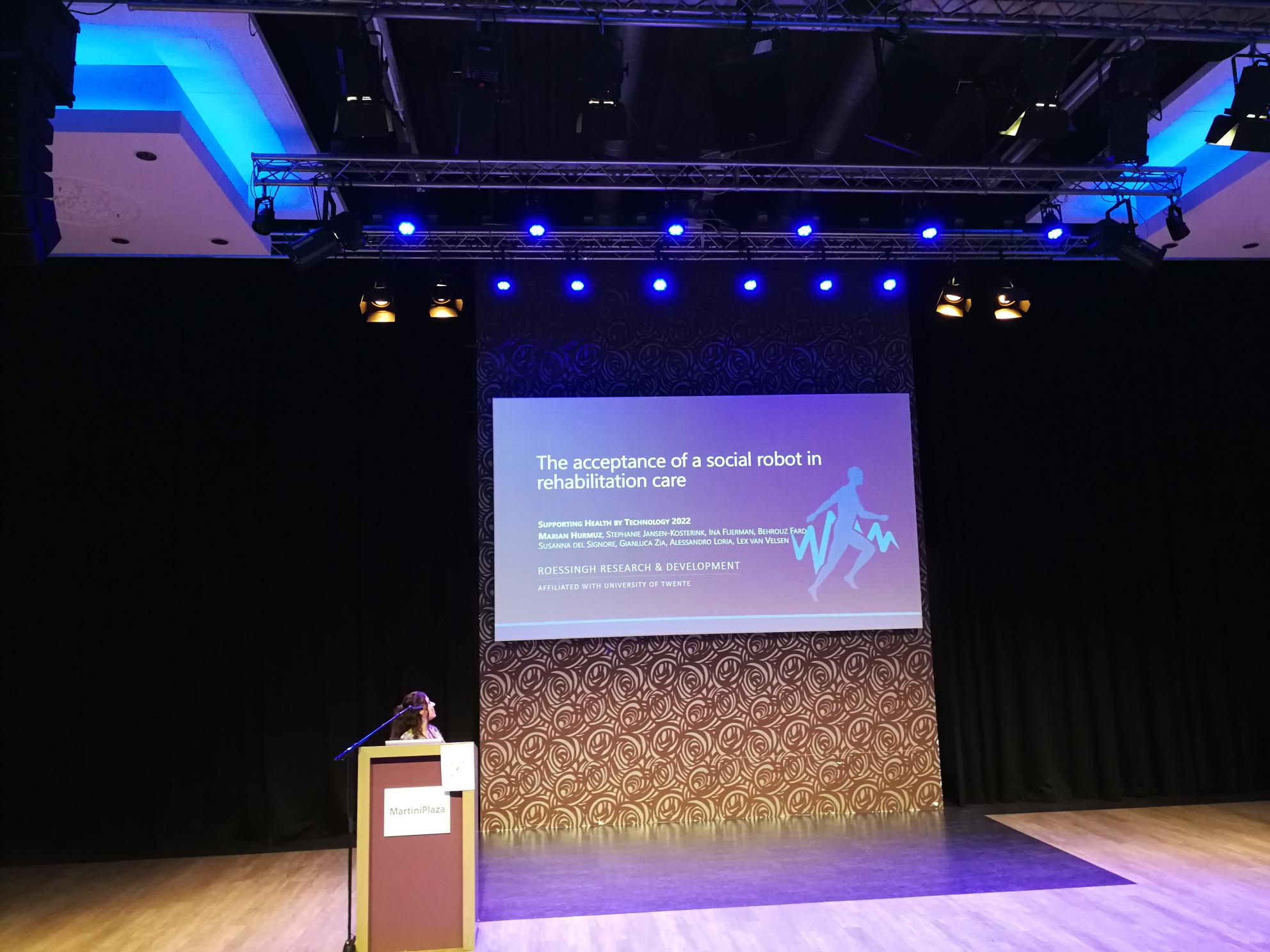
At RRD, we do not do research by locking ourselves in an ivory tower to brood over the next scientific breakthrough. Part of our work is getting out into the world to meet other researchers and interested people and to discuss the progress of eHealth, while communicating our latest findings. The Supporting Health by Technology symposium brings together healthcare professionals, people from academia and organizations that develop eHealth - a perfect stage to present and discuss RRD's latest eHealth research with fellow colleagues across The Netherlands and beyond. For the 11th edition of the symposium, RRD colleagues Lena Brandl, Marian Hurmuz and Stephanie Jansen-Kosterink joined the event at Martini Plaza in Groningen, The Netherlands.

During the conference, current and important developments and challenges for eHealth were discussed:

  • The world has seen a rapid increase in the development of individual eHealth applications. Google's Play Store and Apple's App Store nowadays offer a wide range of eHealth apps with varying degrees of functionalities and pricing for all sorts of health problems. But it is less clear how we can join forces and develop a global eHealth strategy to exploit technology's potential to improve modern healthcare.
  • The inclusion of people from all regional, educational and ethnic backgrounds, including people who suffer from more than one disease (called multi-morbidity) is crucial for developing eHealth that actually helps people manage their health problems in everyday life. How can we include difficult-to-reach groups in eHealth research, and thereby prevent that the technology we develop makes today's digital divide worse?
  • What is the state of machine learning in eHealth, what tasks can it do and how can it be optimized for supporting healthcare professionals in their work?

These are some of the questions addressed at Supporting Health by Technology. RRD contributed to the discussion by presenting some of our recent eHealth research:

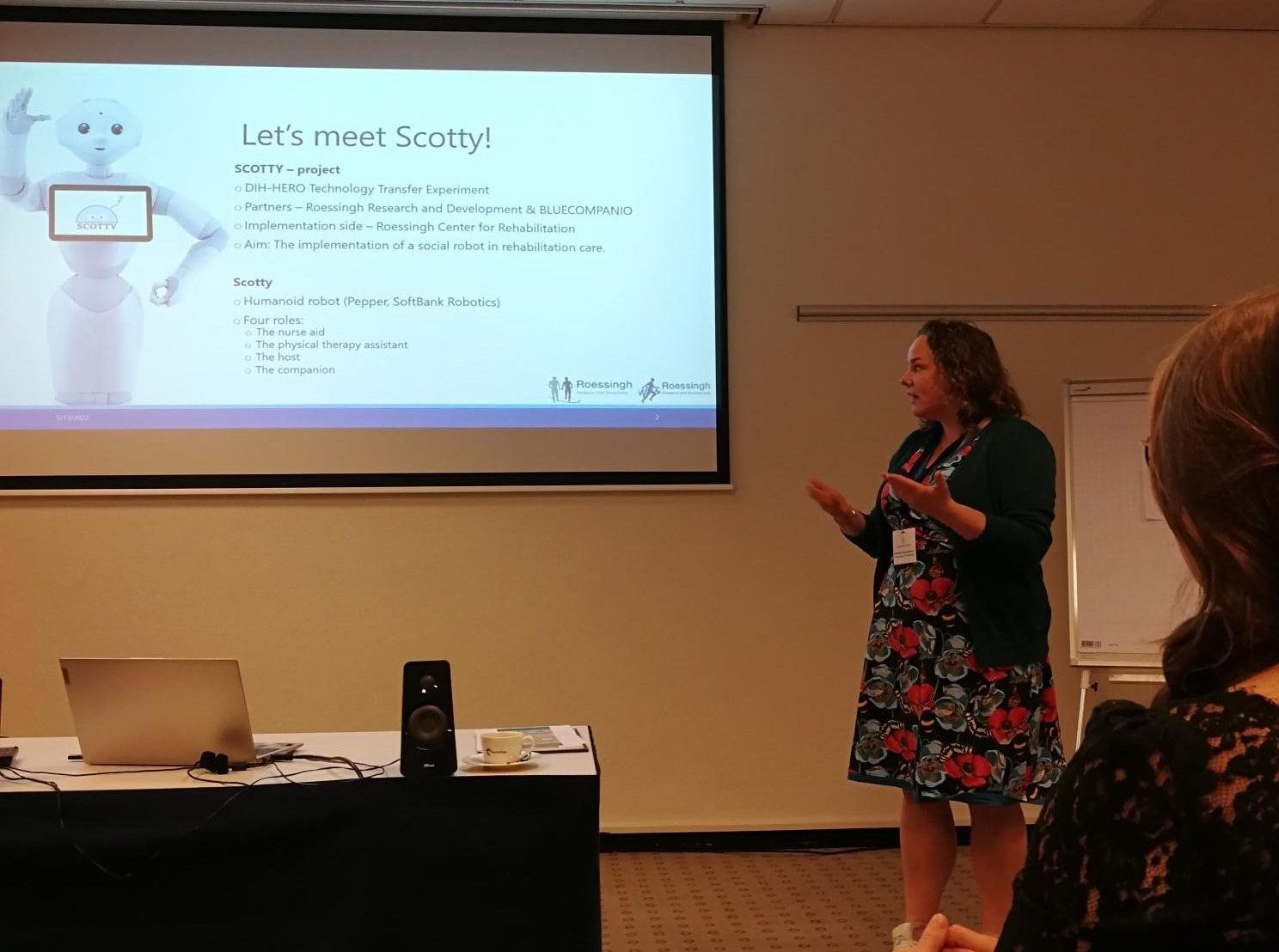
  • Marian Hurmuz presented the results of a social robot acceptance study conducted with patients and nurses in the Roessingh rehabilitation center, summarizing their acceptance and intention to use the social robot for daily care activities (SCOTTY project).
  • Stephanie Jansen - Kosterink demonstrated the value of the SROI (Social Return on Investment) method to access the societal impact of innovations in healthcare and how the method can help decide whether the societal impacts of employing a social robot in rehabilitation care outweigh the robot's monetary investments (SCOTTY project).
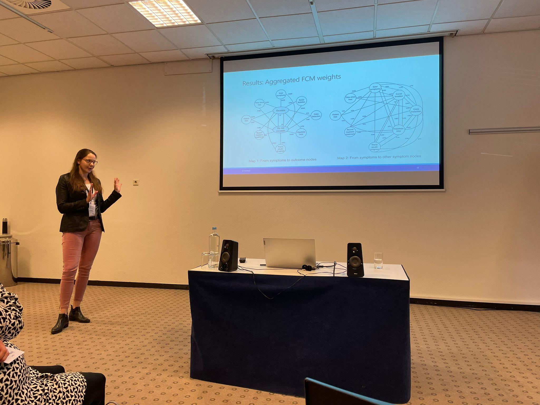
  • Lena Brandl presented an automatic decision-making algorithm using a method called Fuzzy Cognitive Maps (FCMs) in a self-help eHealth service for older mourners. The aim of the decision making algorithm is to guide the older mourner to offline support in case they find themselves in need of support beyond the online service (LEAVES project).

With new ideas and questions buzzing in our heads, we return to RRD to continue our work on eHealth!

MicrosoftTeams-image (2)
MicrosoftTeams-image (3)
MicrosoftTeams-image (4)

Flash mobs as a research method?

By Kira Oberschmidt

When you hear the words "flash mob" you probably think of people suddenly starting to dance inside a mall. Or maybe an orchestra giving an impromptu concert in a market square? A few years ago such seemingly spontaneous social activities were very popular. And now the 'flash mob' has found its way into research.

In academia, a "flash mob" of course doesn't include dancing or music. Instead it means trying to involve many different participants in a short period of time. And not only the conduction of the research is fast-paced, the analysis and reporting should also be done quickly.

The relatively new method came on our path when we were planning a final study for the SALSA project, and we decided to give it a shot. Within the SALSA Health project, we evaluate a technology that stimulates exercise in rehabilitation through the use of games. The system can be adjusted to the range of motion of a patient, and individual exercise schemes can be added and saved. After a previous six month testing period at a physiotherapist's, we were now interested in the potential of SALSA Health for the rehabilitation context.

So at the beginning of April, we set up a big tv screen and a Kinect sensor in the entry hall at Roessingh, Centre for Rehabilitation, Enschede. Patients and therapist could spontaneously stop by and try out the SALSA Health system. Then, they were asked to complete a short survey on their experience, and whether they would like to make use of SALSA Health in their treatment.

Both patients and healthcare professionals liked SALSA Health and saw its potential to enhance rehabilitation care. But what was equally important for us was the successful conduction of our first flash mob study. As expected, there were some teething problems, but also a lot of things that went well. Based on our experience, we came up with some tips for anybody who wants to conduct similar flash mob studies:

  • Give people time. In Dutch we call it 'kat uit de boom kijken' (see which way the cat jumps). People might walk by and look four times, and hopefully the fifth time they will stop and ask what you are doing. So allow enough time for this in your study.
  • Create awareness. Of course, a researcher should be present at all times to explain what you are doing there. But you should also make use of materials like banners or flyers for those who want to learn about your research, but don't want to commit to anything yet.
  • Involve insiders. The best way to get people to join is by having a peer (in our case another patient or a colleague) tell them about it. So stimulate participants to tell others! Maybe a therapist can email his colleagues, or a patient can bring her roommate along later.
  • Keep it short. Participation in the flash mob is meant to be short and spontaneous, so limit what you ask of people. This also allows you to involve those who have little time or walk by in between meetings.
  • Adjust the location to your target group. Find a place where your target group is sure to find you, but where they also feel comfortable to participate. Being seen by everybody is nice to draw attention to your research, but may also scare people off.

We will also be implementing these tips ourselves in the future, since this definitely wasn't our last flash mob. Actually we are planning a new one right now, so keep an eye out! And if you are interested or have any questions, get in touch!


If interested, you can learn more about the flash mob method here:

Moons, P. (2021). Flash mob studies: a novel method to accelerate the research process.

Or read about an example of a flash mob study here:

van Nassau, S. C., Bond, M. J., Scheerman, I., Van Breeschoten, J., Kessels, R., Valkenburg-van Iersel, L. B., ... & Roodhart, J. M. (2021). Trends in Use and Perceptions About Triplet Chemotherapy Plus Bevacizumab for Metastatic Colorectal Cancer. JAMA network open, 4(9), e2124766-e2124766.

INFINITECH: Project and research

By Marian Hurmuz and Kira Oberschmidt

RRD is part of the European project INFINITECH. This project is funded by the European Union's Horizon 2020 research and innovation program (No. 856632). Within INFINITECH, many partners work together to lower the barriers to BigData, Internet of Things, and artificial intelligence-driven innovation, promote regulatory compliance, and encourage additional investment.

RRD's role within this project is to investigate users' willingness to share data with health insurers and to collect information on the use of an eHealth application.

Sharing data with health insurance companies?

To achieve the first goal, RRD conducted a questionnaire survey. In this survey, RRD examined the extent to which adults are open to sharing medical or lifestyle data with their health insurer. From the Netherlands, Germany and 34 other countries, a total of 180 people (57.8% female) participated in this survey. The results were:

  • The majority of participants indicated that they would not share data with their health insurance company, regardless of what benefit might be derived.
  • Looking at the people who are open to sharing, the group is larger in terms of sharing lifestyle data (e.g., steps taken per day) than sharing medical data (e.g., self-measured blood pressure readings).
  • Participants were most likely to share data when they received a personal health risk analysis for doing so.
  • Participants were least likely to share data when given a free product in return.

Would you like to test eHealth?

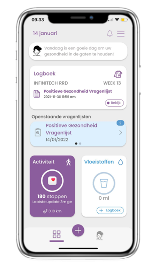
Another study is currently being conducted at RRD to collect data regarding the use of an eHealth app. Within this study, participants are given access to the Healthentia app (see Figure 1 below). This app allows users to monitor their health. This is done by tracking their physical activity and completing questionnaires.

Participants can use the Healthentia app for an extended period of time (up to one year). The purpose of this study for RRD is to find out how the app is used over a long period of time, why the app is used, and by whom the app is used for an extended period of time. Currently, 61 adults have signed up for this study.

RRD is permanently looking for new participants 18 years of age or older for this study. Would you like to help us within this study? If so, please visit for more information: https://www.rrd.nl/infinitech/

Picture1

7 lessons for designing virtual agents for eHealth

By Lex van Velsen

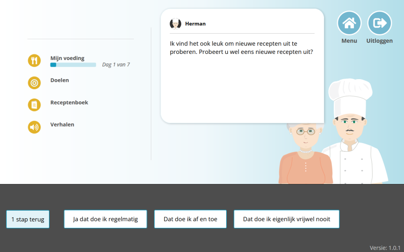
In the past years, I (or rather, RRD) have participated in numerous projects in which we developed virtual agents for eHealth. Virtual agents that supported healthy eating, cognitive health, or supporting older adults in the mourning process after losing their spouse. In all of these projects, we have learned valuable lessons in the design, implementation and evaluation phase. In this article, I would like to share 7 lessons with you for designing virtual agents for eHealth.


  1. The more advanced its functionalities, the more human-like the appearance of the virtual agent should be. This is in line with the expectations of end-users, where the level of simplicity of the agent appearance should match what it does.
  2. Include humour in the dialogues, but not too much. A discussion with a virtual agent should be engaging. Humour can certainly help here, but too much humour will have a detrimental effect on the interaction. So joke with caution, and test the end result with potential end-users.
  3. Make sure that the most important UX aspects for virtual agents for health -'usefulness' and 'enjoyability'- are taken care of. Virtual agents for health should do two things, be useful and engaging. This way, their effectiveness and efficiency are optimized, while end-users keep on using the service. Be sure to have a keen eye on usefulness and enjoyability during the design and testing process.
  4. Be cautious with making the virtual agent look like a peer, it induces bias. It is tempting to make the virtual agent look like a peer of the end-user. You can imagine it will instil feelings of trust and relatedness. However, for the case of older adults, we found out that this introduces ageism. Societal prejudices towards older adults were embodied in the virtual agent and not appreciated by test users.
  5. First impressions last. The first impressions that end-users have of a virtual agent will last months, and will thus affect both the short and long term interaction.
  6. First impressions of a virtual agent are shaped by two factors. The presence of positivity and attentiveness are the factors that, in first instance, predominantly make up whether or not an end-user takes a liking towards a virtual agent for the health context.
  7. More realistic virtual agents lead to more compliance. End-users are more willing to comply with advice given by a realistic agent than with advice given by, let's say, a cartoonish agent.
MicrosoftTeams-image (3)


Credit due where credit is due. Most of these lessons were the result of the hard work of some of our junior researchers. I would especially like to mention Silke ter Stal and Leonie Kramer here.

Did we inspire you to embed a virtual agent in your own eHealth service? Or do you want to improve your current virtual agent? Drop us a note, we would love to talk shop.

SmartWork: Smart Age-friendly Living and Working Environment

SmartWork is a project funded under the Horizon 2020 research and innovation action programme (grant agreement No 826343), which started in January 2019 and ends in March 2022. The main aim of the SmartWork project was to build a system that supports older adults staying actively working as long as desired (also called work ability sustainability).

As one of nine research partners, RRD has developed several services and algorithms which were showcased in a demo at the 2nd Workshop on Smart, Personalized and Age-Friendly Working Environments. This workshop was held in conjunction with the 13th International Joint Conference on Computational Intelligence (IJCCI 2021) in October 2021.

This demo video, that can be found below, shows the services that RRD developed as part of the H2020 SmartWork project:

  1. the modules of the healthyMe smartphone application;
  2. the iCare portal;
  3. the Interventions Manager Service (IMS).


healthyMe smartphone application

The healthyMe smartphone application is the main mobile entry point for the users to collect and visualize physiological, activity and lifestyle data. It is available on Android and iOS in three languages (English, Danish, Portuguese). Each module (steps, sleep, heart rate, food diary, weight, exercises) has its own widget, presenting the collected data in daily, weekly and monthly overviews. These collected data are automatically measured through:

  • an activity tracker to measure physical activity, sleep and heart rate (Fitbit Charge 3); and
  • a smart scale to measure body weight (Withings Body).

The food diary in the application allows users to manually track their food intake, which raises their awareness of the total amount of energy consumed. The office-friendly exercise widget presents a library of video-guided exercises that have been recorded in collaboration with healthcare professionals. The exercise videos allow users to safely perform physical exercises at home or at work at the time of their best convenience. The integrated filter allows the user to select exercises by body parts (shoulders, neck, back, arms, legs).

The virtual coach "Amelia" guides users through the application, starting with an intake dialogue through which users can set their activity goals. Depending on their actual level of physical activity that is tracked later on, the goal is automatically adjusted. If a person is less active, the step goal will be adjusted and increased if a person reached their step goals. To prevent demotivation, the automatically adjusted goal is always slightly higher than was reached in the previous week and hence likely to be achievable for the person.


iCare portal

The iCare portal is a service that allows formal and informal caregivers to support the older office worker reaching their health goals. Strong focus is placed on privacy and control in that the office worker can configure within the healthyMe service which data they want to share, from which period of time and with whom. After configuration, summaries of health-related information collected within the healthyMe service are visualised in a web-based portal. This way, the caregiver can monitor the health status of the office worker and provide support for the self-management of health conditions.


Interventions Manager Services (IMS)

The Interventions Manager Services (IMS) is a centralized component within the SmartWork platform that acts as a smart message hub for triggered interventions. From the back-end service side, the IMS can be called if any of the smart services developed within SmartWork decides that some intervention should be triggered. From the client side, the IMS lets the SmartWork client applications register themselves to be notified of triggered interventions. Through the IMS, all smart services have a single entry-point for delivering intervention triggers, and all client applications have a single entry point for registering to receive triggers. Another motivation for the single entry-point was to avoid overloading the user with multiple notifications of triggered interventions at the same time. Currently, only one intervention is delivered at a given time, and in the future more sophisticated intervention prioritisation mechanisms can be implemented.

After a bit over 3 years, the SmartWork projects is coming to an end this month. It was a great collaboration with research partners from Greece, Switzerland, Portugal, Sweden, Denmark, United Kingdom, Ireland and The Netherlands. We enjoyed working together with the partners and hope we can collaborate in future projects.

eHealth is not a microwave: so why use the same usability evaluation instrument? 

By Marijke Platenkamp-Broekhuis 

When I started my PhD on usability benchmarking of eHealth applications, I noticed a certain level of skepticism. There was this notion that usability was 'figured out', that there was nothing new to discover. In this blog post I will argue why the concept of usability is still worthy for further exploration, especially in the field of eHealth.  

The general definition of usability has not changed since the '90s. It is described as: 'The extent to which a system, product or service can be used by specified users to achieve specified goals with effectiveness, efficiency and satisfaction in a specified context of use'. On the one hand, this definition is clear: the user needs to be able to use the system effectively, efficiently and satisfactorily. However, on the other hand the definition is fuzzy as it does not specify the type of system, users, the goals and context-of-use. You, as a researcher or usability expert, need to fill this in and decide what effective or satisfactory use means for your product. That needs to be taken into account during the evaluation of the application's usability. The funny thing is, that when we evaluate usability of systems and applications, the same instruments are used for all different kinds of (digital) applications. Research showed that usability questionnaires are the most popular means to evaluate an application's usability. These questionnaires, of which the System Usability Scale (SUS) is most frequently used, are all general in the sense that they do not consider specific product, user, goal or contextual characteristics that may affect the user's perception of the usability. In my opinion however, we need to reverse this process: by starting to define usability from these characteristics and then select or build a suitable instrument to evaluate the usability of this application. In other words, to define and evaluate usability based on the system domain. In my research this has been the field of eHealth.  

For eHealth applications, it is especially important to consider these product, user, goal or contextual characteristics for a couple of reasons: 

Product: The SUS has been used for a wide variety of products, like microwaves, eLearning platforms, eHealth applications and computer programs. However, a microwave is not even remotely similar to an eHealth application. So it does not make slightest sense to use the same questionnaire to evaluate the usability of both systems. Now I guess you are with me on the whole 'eHealth is not a microwave' argument, but I could imagine you thinking that for other digital applications, may it be eHealth, eLearning or eCommerce, usability involves similar aspects. This is true to a certain degree. However, eHealth applications includes often medical terminology, are connected to other health applications or built in a certain way to accommodate for visual, cognitive or physical health impairments of the intended target audience. Furthermore, user problems could lead to hazardous situations. For example, I once found the following usability issue in a dataset of an online application for people with diabetes type 2: The user does not understand the word 'hypoglycemia'; it is not clear if this indicates a high or low blood sugar level. This is an example of a potentially life-threatening situation when the user does not understand signals from the eHealth application. It is therefore not sufficient to ask if the application is easy to use; you want to know if the user understands the medical terms, feedback and signals of the application. These are factors that are not relevant for webshops or eLearning platforms.  

User: For eHealth applications, the end-users are often (1) people with a certain health condition, (2) (a subset of) the general population or (3) health professionals. It could also be that an eHealth application is used by both patients and health professionals. This is often the case if an application is used within treatment programs. For example, the patient uses the eHealth application to receive information or do exercises at home while the health professional monitors the progress and sends his or her patient the exercises via the application. If the user is a patient, the eHealth application needs to make sure that the terminology and wording fit with the knowledge the user has about his or her health condition. Also, it could be that the user has a visual or physical health impairment that could hinder user-system interaction (like when having small buttons on a phone for people with hand muscle or joint problems). Likewise, if the eHealth application is primarily used by health professionals and it does not fit within their work flow or support their tasks, the application will not be used.  

Goal: eHealth applications are designed with a specific health goal in mind: to prevent, inform about, diagnose, treat or monitor a health condition. Users need to be aware of the health goals the application can provide. If the users like using an eHealth application but they do not see how it can support their or their patient's health condition, again, you end up with a smooth working application that few will actually use.

Contextual: The eHealth application is often embedded within a medical institute or treatment program. While you can use an app on your smartphone anywhere and anytime you want, eHealth applications can be confined to specific training rooms within a medical center (like a VR system in the training room of physiotherapy practice) or dates and times (where the user needs to fill in a health questionnaire at certain time intervals). It is important to make sure that the system is not only user-friendly, but that it is also suitable for the given context in which it is used. If the VR system takes up too much time setting up during a training session, the health professional will probably skip this system and move to other fitness equipment that is easier to start. 

How suitable is a general usability evaluation instrument to evaluate the usability of eHealth applications?

 
Taking this all in mind, I wanted to put it to the test: how suitable is a general usability evaluation instrument to evaluate the usability of eHealth applications? To find the answer, I conducted usability evaluation studies with three different eHealth applications. I compared the System Usability Scale with task performance data and the number of minor (e.g. the user does not like the music), serious (e.g users with colour blindness have difficulty distinguishing elements in the interface) and critical (e.g. the user does not know how to schedule an exercise for the patient) usability issues. These usability issues were derived from a think aloud test. This list of usability issues based on a qualitative data collection method is considered to be the best indicator of a system's usability (however, it is not the most efficient way to measure the usability of an application as it takes up much time and effort from both researcher and participant, hence the preference for questionnaires). If there are few serious or critical issues, the usability can be considered quite good. I was curious to see if a low (or high) SUS score would result in more (or less) serious or critical usability issues. 

Our results indicated that actually task completion, the number of tasks users were able to complete, had a better correlation with the number of serious and critical usability issues and the SUS. This indicates that the SUS is not sufficient for usability evaluations for eHealth applications.  

Now that we know that usability has to be interpreted differently for eHealth applications and that a general instrument like the SUS is not good enough, the next step is to conceptualize usability for the eHealth domain. In my next blog, I will continue with exploring the concept 'eHealth usability'. 
 
If you want to read more about the study I described in this blog, here below you find the information:

 
Broekhuis, M., van Velsen, L., & Hermens, H. (2019). Assessing usability of eHealth technology: A comparison of usability benchmarking instruments. International Journal of Medical Informatics, 128(January), 24-31. https://doi.org/10.1016/j.ijmedinf.2019.05.001  
  • LINKEDIN

 © Copyright - Roessingh Research and Development